

iOS developers and UI designers
Starting a new news app project and needing a consistent UI component library.
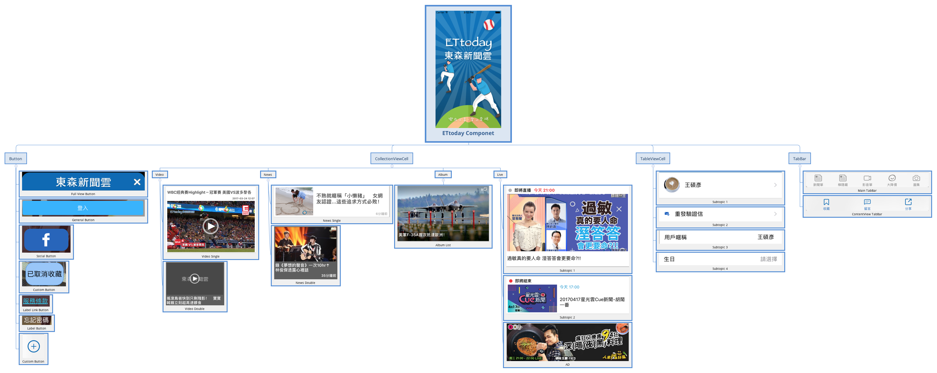
The ETtoday Component mind map template provides a structured catalog of reusable UI components for building news and media applications. It organizes 30 nodes into four main categories: Button, CollectionViewCell, TableViewCell, and TabBar. The Button branch includes six variants such as 'Full View Button', 'Social Button', and 'Label Link Button', while CollectionViewCell covers Video, News, Album, and Live sections with subtypes like 'Video Single', 'News Double', and 'Album List'. This template serves as a component cheat sheet for iOS developers and designers working on ETtoday-style interfaces, helping standardize UI elements across projects. It is best used as a reference during app development or as a checklist for component inventory.
Conditions d'utilisationStarting a new news app project and needing a consistent UI component library.
Auditing an existing app to identify missing or redundant UI elements.
Onboarding new team members and providing a visual reference of reusable components.
Launch the template in Xmind to browse the structured categories of Button, CollectionViewCell, TableViewCell, and TabBar nodes.
Rename existing components or add specific notes and images to each node to match your project's unique UI requirements.
Save your finalized component inventory as an image or PDF to provide a standardized cheat sheet for your development team.
The template covers four main categories: Button (6 variants), CollectionViewCell (Video, News, Album, Live), TableViewCell (4 subtopics), and TabBar (Main and ContentView).
Open the .xmind file in Xmind, then expand each branch to review component names. Use it as a checklist to ensure all UI elements are designed and implemented consistently.
Yes, you can add new component types, rename existing nodes, or attach notes and images to each node for detailed specifications.
It organizes content display cells for video, news, album, and live sections, with single and double layout variants for flexible grid designs.
While named for iOS conventions, the component categories are platform-agnostic and can be adapted for Android or web UI inventories.
Partagez vos modèles de cartes mentales avec des créateurs du monde entier et commencez à gagner avec votre travail.

