

Data analysts and UX designers
Designing a new dashboard for a client's quarterly report
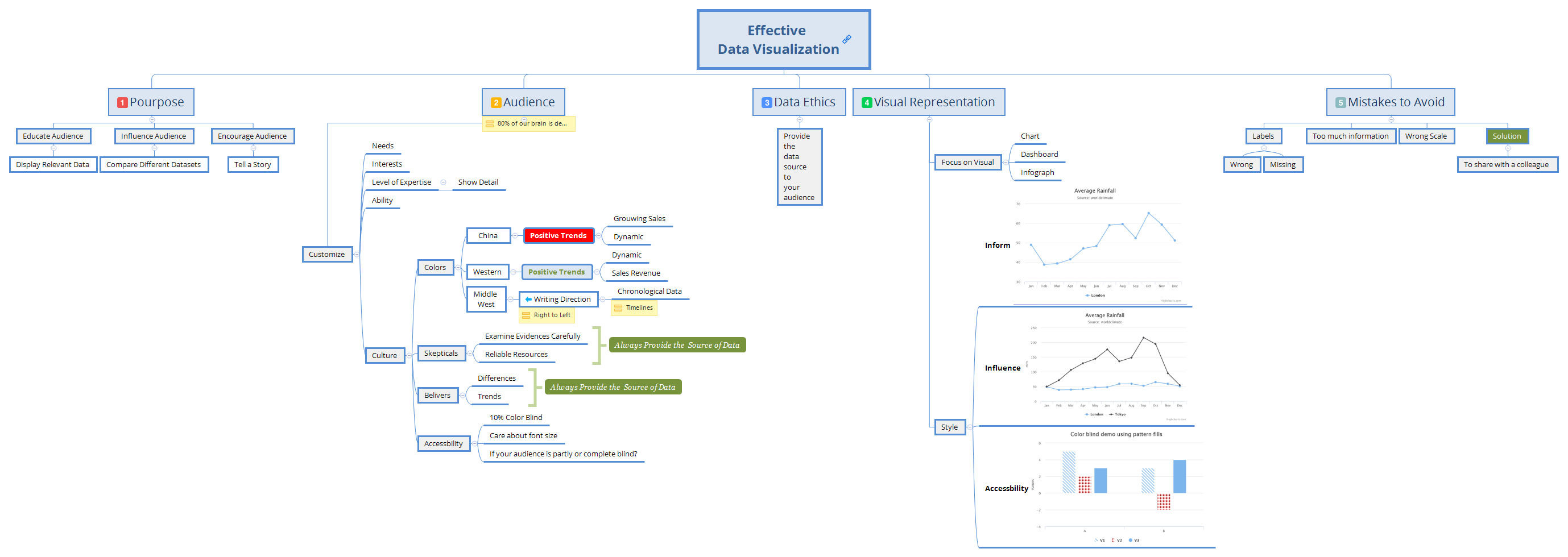
The Effective Data Visualization mind map template, used by web developers, data analysts, and designers, covers 59 nodes across 5 core branches: Purpose, Audience, Data Ethics, Visual Representation, and Mistakes to Avoid. It provides a structured framework for creating clear, impactful visualizations. Key nodes include 'Educate Audience', 'Influence Audience', and 'Mistakes to Avoid' with sub-nodes like 'Wrong Scale' and 'Too much information'. This template serves as a cheat sheet for best practices in data visualization.
Conditions d'utilisationDesigning a new dashboard for a client's quarterly report
Preparing a data-driven presentation for a conference
Reviewing an existing visualization for potential misleading elements
Open the template in Xmind to explore the five core branches covering Purpose, Audience, Data Ethics, Visual Representation, and Mistakes to Avoid.
Personalize the map by adding your specific data details and audience requirements directly into the existing nodes to build your visualization strategy.
Use the built-in checklist to avoid common mistakes before exporting your completed mind map as an image or PDF for your presentation.
The template includes 59 nodes across 5 main branches: Purpose, Audience, Data Ethics, Visual Representation, and Mistakes to Avoid. It covers strategies for educating and influencing audiences, customizing for different user groups, ethical data practices, visual styles, and common pitfalls.
Start by defining your purpose (educate, influence, or encourage). Then analyze your audience's needs, interests, and expertise. Apply data ethics by citing sources. Choose a visual style (chart, dashboard, or infographic) and avoid common mistakes like wrong scale or too much information.
Yes, the template is fully editable. You can add, remove, or modify nodes, change colors, and rearrange branches to fit your specific project. It works in Xmind desktop and web versions.
Use the 'Mistakes to Avoid' branch to check for wrong labels, missing labels, wrong scale, and information overload. Also review the 'Data Ethics' node to ensure you provide data sources, and customize the 'Audience' branch for cultural sensitivity and accessibility.
Absolutely. The 'Audience' branch guides you to customize for level of expertise and culture. The 'Purpose' branch helps you tell a story or compare datasets, making complex data accessible to any audience.
Partagez vos modèles de cartes mentales avec des créateurs du monde entier et commencez à gagner avec votre travail.

