

Business analysts and managers who need to communicate metrics clearly
Preparing a quarterly business review presentation with data-heavy slides
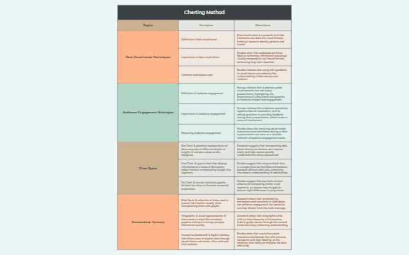
The Charting Method mind map template provides a structured overview of data visualization and presentation techniques, covering 32 nodes across five core branches: Topics, Data Visualization Techniques, Audience Engagement Strategies, Chart Types, and Presentation Formats. It defines key concepts such as 'Bar Chart' and 'Interactive Dashboard', and explains the importance of data visualization and audience engagement. This Charting Method template serves as a cheat sheet for presenters, analysts, and educators looking to enhance their visual communication skills. The mind map explicitly breaks down common chart types like Line Chart and Pie Chart, and explores presentation formats including Slide Deck and Infographic, making it a practical reference for creating effective data-driven presentations.
Términos y condicionesPreparing a quarterly business review presentation with data-heavy slides
Designing an infographic for a marketing campaign report
Teaching a workshop on effective data storytelling and visualization
Download the .xmind file and open it to explore the five core branches covering data visualization and audience engagement.
Replace placeholder descriptions with your specific data and add new child nodes to detail unique chart types or presentation formats.
Save your completed mind map and export it as an image or PDF to use as a visual reference for your presentation.
The template includes 32 nodes covering topics like data visualization techniques, audience engagement strategies, chart types (bar, line, pie), and presentation formats (slide deck, infographic, interactive dashboard).
Open the .xmind file in Xmind, then explore the branches to select relevant chart types and presentation formats. Customize the nodes with your own data and audience engagement tips to build your presentation outline.
Yes, the template is free to download and fully editable in Xmind. You can add, remove, or modify nodes to fit your specific presentation needs.
Start by reviewing the 'Data Visualization Techniques' branch to understand core concepts, then study each chart type in 'Chart Types' to see how they represent data. Finally, explore 'Presentation Formats' to choose the best medium for your audience.
Absolutely. Each chart type node (e.g., Bar Chart) contains a description that you can edit or expand with your own examples and notes directly in the Xmind editor.
Comparte tus plantillas de mapas mentales con creadores de todo el mundo y empieza a ganar con tu trabajo.

